



A palette can be full of beautiful embroidery floss and still look flat, chaotic, or strangely disconnected once you begin stitching. The problem is usually not that you chose the “wrong” colors. More often, the shades are too similar in lightness, too evenly intense, or competing for attention.
You do not need to memorize advanced color theory to fix this. A reliable floss palette has three things: a clear color relationship, enough light-and-dark contrast, and one obvious visual leader. Here is how to choose embroidery floss colors with confidence, even if you have never built your own palette before.
Start With Three Color Qualities
Before comparing skeins, learn to notice three separate qualities: hue, value, and saturation. Looking at each one separately makes color choices much easier.
Hue: What Color Is It?
Hue is the color family: red, orange, yellow, green, blue, or violet. Coral and burgundy are different versions of red; mint and forest green belong to the green family.
Hue relationships help a palette feel intentional. Colors close together on a color wheel tend to blend gently, while colors farther apart create more energy and contrast.
Value: How Light or Dark Is It?
Value describes how light or dark a color appears. Pale blush has a light value; deep burgundy has a dark value.
Value is especially important in embroidery and cross-stitch because it separates shapes and creates depth. Two floss colors may look different in hue but become almost identical in a black-and-white photo. If they have similar values, a border can disappear into the object it is supposed to outline, and highlights or shadows may not read clearly.
Saturation: How Bright or Muted Is It?
Saturation describes a color’s intensity. A vivid turquoise is highly saturated; a dusty blue-gray is more muted.
Bright colors naturally demand attention. If every floss color is equally vivid, the eye may not know where to look. A few muted shades can give a brighter accent room to shine.
If the materials themselves are still unfamiliar, begin with our beginner’s guide to cross-stitch threads and color combinations.
Choose One Main Color Before Building the Palette
Begin with one anchor color rather than pulling five unrelated favorites. Your anchor might come from the subject - a green for a leaf, for example - or simply be the shade you most want to use.
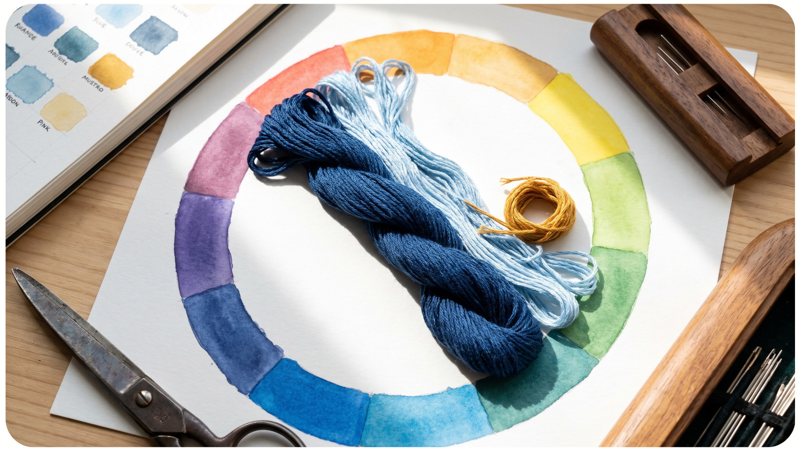
Then decide what job the anchor will do:
• Dominate most of the stitched area.
• Define the focal point.
• Establish the mood.
• Connect several smaller accents.
This decision creates hierarchy. Not every color should occupy the same amount of space or carry the same visual weight. A practical beginner approach is to let one color family dominate, use a second in a supporting role, and reserve the strongest contrast for small accents. Treat this as a starting point, not a fixed formula.
When you are recoloring an existing design instead of starting from scratch, follow the safeguards in our guide to customizing embroidery patterns for your style.
Use a Simple Color Harmony
A color wheel is a guide to relationships, not a machine that guarantees a beautiful result. After choosing your anchor, use one of these beginner-friendly structures.
Monochromatic: One Hue, Several Values
A monochromatic palette uses light, medium, and dark versions of one hue. Think pale sage, leafy green, and deep forest green.
This is the easiest way to create cohesion and believable shading. The important part is value separation. Three medium greens will not create as much depth as a clearly light, medium, and dark set.
Analogous: Neighboring Colors
Analogous colors sit near one another on the wheel, such as yellow, yellow-green, and green or blue, blue-violet, and violet. They usually create a smooth, related palette that works well for florals, landscapes, and gentle gradients.
Because the hues are close, check the values carefully. Add a noticeably lighter or darker floss if the design begins to look flat.
Complementary: Opposites With Strong Contrast
Complementary colors sit across from each other on the color wheel, such as blue and orange or violet and yellow. They create strong visual energy and can make each other appear more intense.
For an easier-to-control palette, do not use both colors in equal amounts. Let one dominate and use the opposite color as a smaller accent. A mostly blue design with a few warm ochre details will usually feel calmer than equal areas of bright blue and orange.
Split-Complementary: Contrast With More Flexibility
Choose your anchor, find its opposite, and then select the two colors on either side of that opposite. A green anchor, for example, can work with red-violet and red-orange accents.
This gives you lively contrast without relying on one direct opposite. It is useful when a complementary pair feels too bold or predictable.
For more concrete combinations, browse these cross-stitch color palette examples and notice how each group balances dominant and supporting shades.
Build Light, Medium, and Dark Roles
Once the hues feel right, stop judging the skeins only by color name. Assign each floss a value role.
• Light: highlights, delicate details, or the brightest edge of a form.
• Medium: the main color that covers most of the object.
• Dark: shadows, outlines, separation, or the deepest areas.
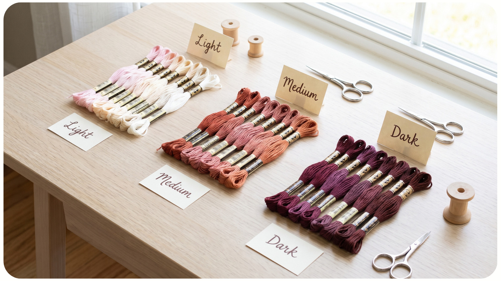
You do not always need all three roles in every color family. A simple motif may use one dark outline, two mid-value colors, and one pale highlight. What matters is that adjacent stitched areas that must remain distinct have enough value difference.
To check, arrange the skeins side by side and take a phone photo. Convert the photo to grayscale. If two essential colors merge into one gray, replace one with a lighter or darker choice. This test does not tell you whether a palette is beautiful, but it quickly reveals weak value contrast.
Balance Warm and Cool Colors
Reds, oranges, and yellows generally read as warm; blues, many greens, and violets generally read as cool. Individual families can lean either way - a green may feel yellow and warm or blue and cool.
You can keep the entire palette mostly warm or mostly cool for unity. Alternatively, use temperature contrast to create a focal point: a warm coral flower against cool green foliage, for example.
The key is repetition. If you introduce a warm accent, repeat a small amount elsewhere so it feels connected rather than accidental. Even two or three tiny repeats can visually carry a color through the composition.
Judge Floss Against the Actual Fabric
Floss never appears in isolation. Fabric color changes the amount of contrast you see around every stitch.
Ivory can soften pale yellows and creams. Black fabric can make bright colors appear more luminous while swallowing very dark shades. Colored fabric may also shift the mood of the whole palette: dusty pink floss can feel delicate on cream and much more subdued on mauve.
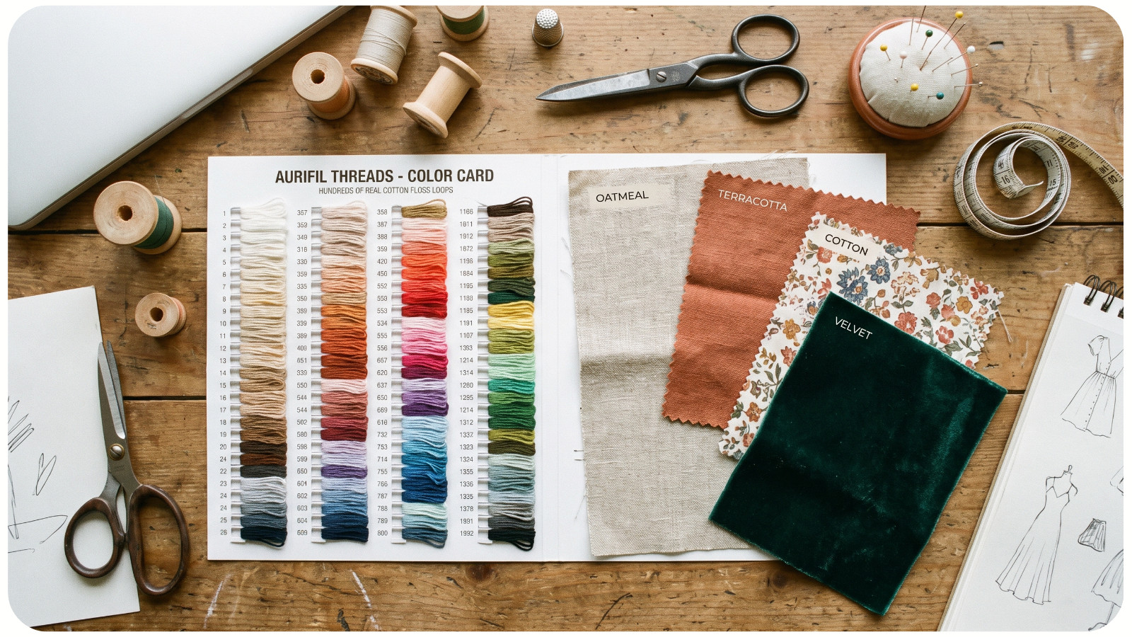
Lay the floss directly on the fabric, fold each skein into a small bundle, and view everything under the lighting where the finished piece will be displayed. Check it again in daylight if possible. Phone screens, store photos, and printed charts are useful starting points, but they cannot reproduce the exact interaction of thread sheen, fabric color, and room lighting.
If accurate matching matters, a threaded color card with real floss samples is more dependable than choosing solely from a screen or printed swatch.
When you need to identify or replace a numbered shade, use our guide to reading, matching, and substituting DMC color codes.
Make a Small Stitch Test
Loose strands show color, but stitched thread also shows texture, coverage, and sheen. Before committing to a large project, make a small test on the same fabric type and count you plan to use.
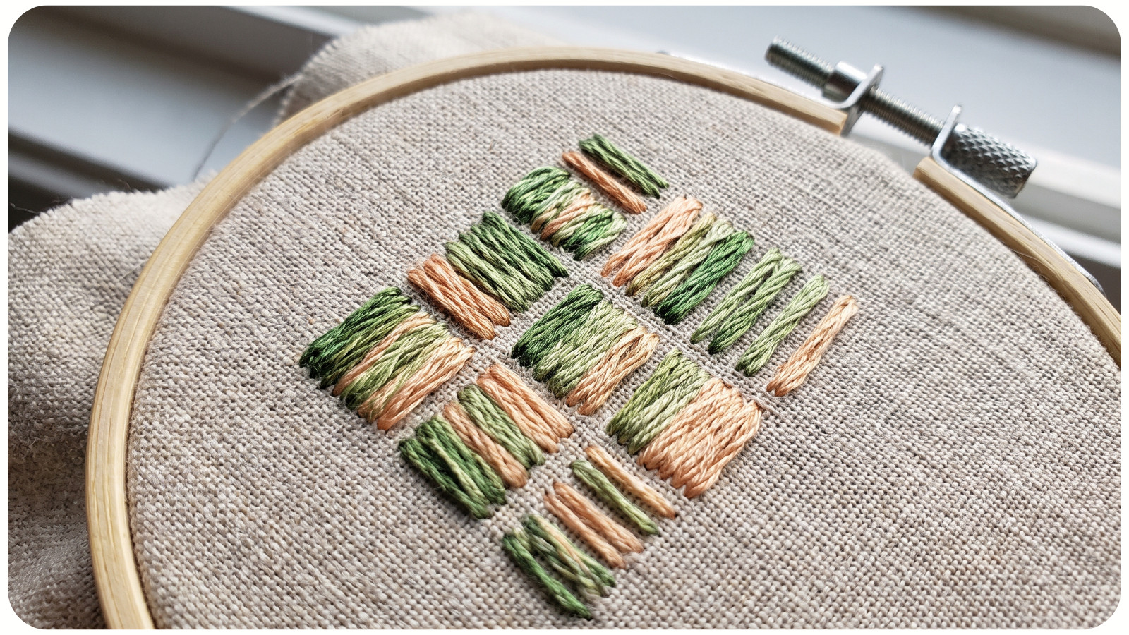
Stitch compact blocks or short rows with the intended number of strands. Place likely neighbors beside one another, including the lightest and darkest colors. Then check the sample from normal viewing distance, not only from a few inches away.
Ask four questions:
1. Can I distinguish the important neighboring areas?
2. Is one color clearly dominant, or are several competing?
3. Does the darkest floss add useful definition without looking harsh?
4. Does the palette still work on the chosen fabric in normal light?
Changing one skein after a ten-minute test is much easier than unpicking a large stitched section.
Common Floss Color Mistakes and How to Fix Them
Every Color Is a Medium Value
The palette looks pleasant in a row but flat when stitched. Add one genuinely light and one genuinely dark option, then repeat the grayscale check.
Every Color Is Equally Bright
Nothing feels special because everything is shouting. Mute one or two supporting colors, or reduce the brightest color to a smaller accent.
The Outline Is Too Harsh
Pure black can overpower a soft palette. Try deep brown, charcoal, navy, plum, or a very dark version of the main hue. Keep black when crisp graphic contrast is part of the intended style.
The Colors Work Together but Not With the Fabric
Move the floss onto the actual fabric before replacing the whole palette. Sometimes changing the fabric to warmer cream, cooler white, gray, or a darker tone solves the problem more cleanly.
Too Many Accent Colors Compete
Remove the accent that adds the least. A smaller palette often looks more polished because repeated colors create rhythm and connection.
A Repeatable Five-Minute Floss-Picking Routine
For your next project, use this order:
1. Select one anchor color and decide where it will lead.
2. Choose a simple harmony: monochromatic, analogous, complementary, or split-complementary.
3. Separate the palette into light, medium, and dark roles.
4. Compare the floss on the actual fabric and check a grayscale photo.
5. Stitch a small sample before beginning the full design.
Beautiful embroidery color combinations are not created by finding a secret set of “perfect” shades. They come from giving each color a purpose. Start with one leader, create enough value contrast, control the brightest accents, and test everything on the fabric. That simple routine will make choosing floss colors faster, calmer, and far more predictable.