


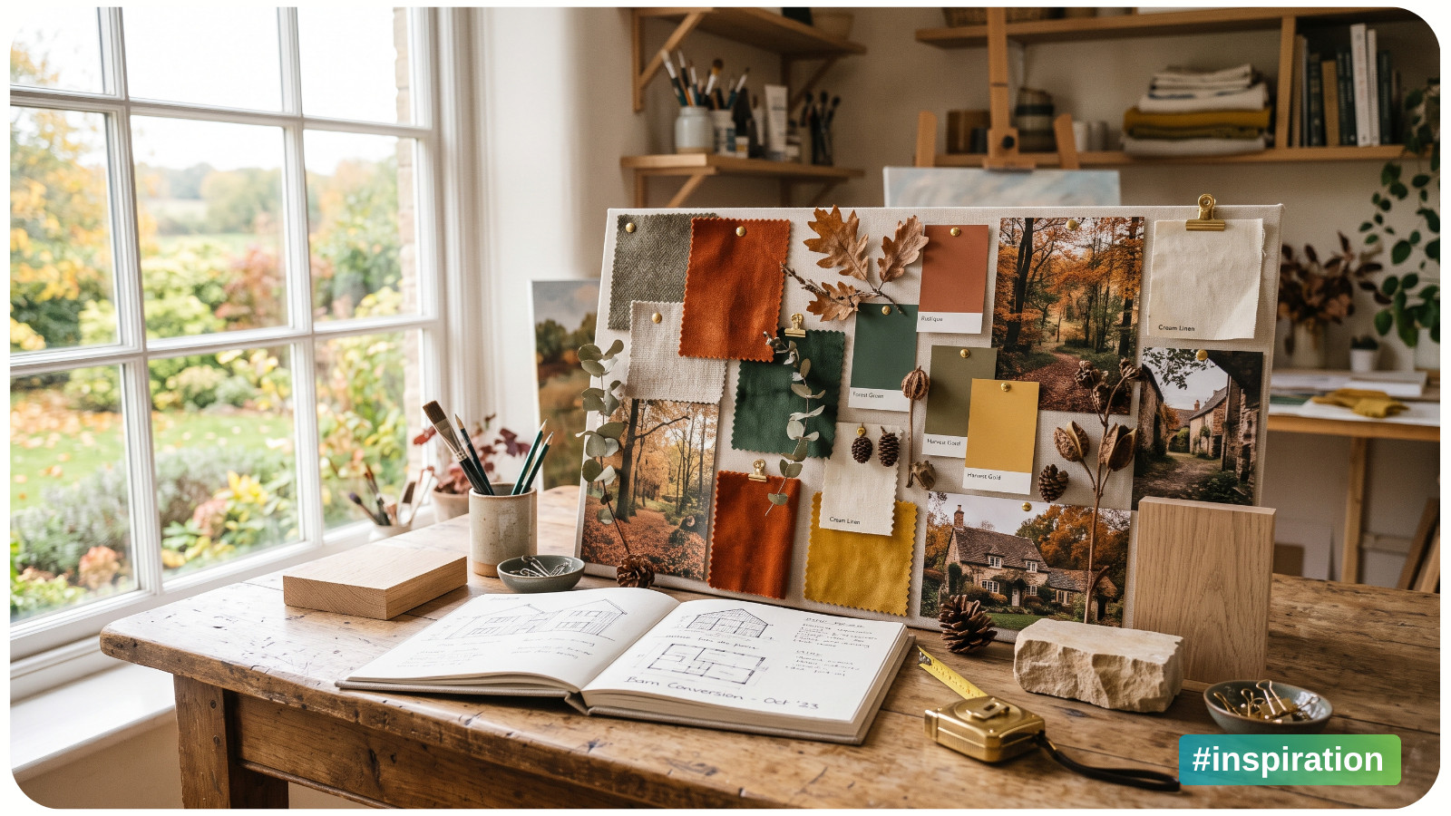
A seasonal mood board can be wonderfully convincing. Five minutes with a few images of amber leaves, striped mugs, wool coats, and candlelit rooms, and suddenly you have designed an entire fall life for yourself.
Then the board sits untouched in a folder called “Fall Inspo.”
Mood boards are useful creative tools, especially when a new season makes you want to refresh your colors, materials, and routines. But many stop at atmosphere. They tell you how you want a season to feel without helping you decide what to make.
A project-ready mood board does both. It captures a feeling and translates that feeling into choices: a palette, a material, a scale, a skill, and a realistic next step. Here is how to turn seasonal inspiration into something you can make with your own hands.
Begin With a Seasonal Point of View, Not the Entire Season
“Fall” is too broad to guide a project. It contains bright foliage, rainy sidewalks, Halloween kitsch, back-to-school nostalgia, harvest tables, misty forests, and the first genuinely cold evening. If you collect all of it, your mood board may be attractive but visually confused.
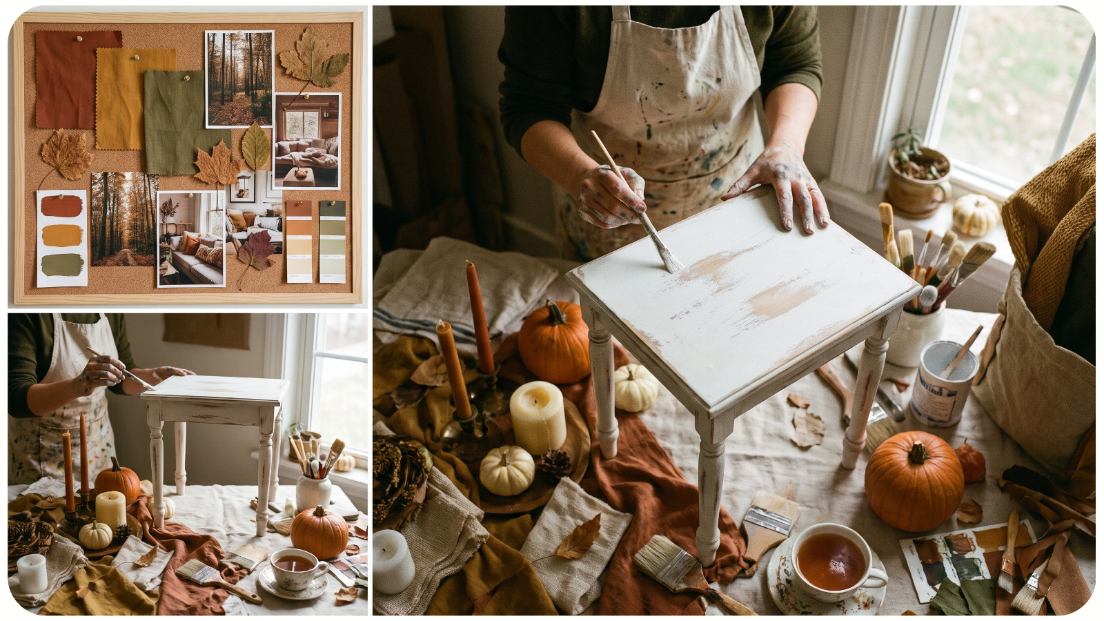
Choose a narrower point of view. Think of it as a sentence that describes the particular version of the season you want to explore:
• Early fall at a lakeside cabin;
• A cheerful, handmade Halloween kitchen;
• The quiet week after Christmas;
• A spring garden before everything blooms;
• A sun-faded coastal summer.
The sentence does not need to sound clever. Its job is to help you edit. A neon-orange plastic pumpkin might belong on a playful Halloween board, but not on one inspired by a foggy October walk. Both can work; they simply lead to very different projects.
If you feel stuck, begin with a real moment rather than an aesthetic label. Recall the first morning you needed a sweater, the color of hydrangeas near the end of summer, or the way winter light falls across your table. Specific memories tend to produce more personal boards than a broad search for “cozy seasonal aesthetic.”
Collect Images for Information, Not Just Beauty
During the first round, collect freely. Save photographs, paintings, packaging, vintage textiles, interiors, botanical details, book covers, and objects. Your sources do not all need to come from the craft world. A ceramic plate may suggest a border for an embroidery design. The color blocking on an old travel poster may solve a quilting problem. A bakery window could inspire the composition of a cross-stitch scene.
After the initial gathering, look at each image and ask what it contributes. A useful image usually gives you at least one of the following:
• Color: a combination you want to test;
• Texture: linen, glazed clay, rough paper, velvet, or weathered wood;
• Shape: scallops, branches, stars, arches, checks, or rounded lettering;
• Composition: a central motif, scattered arrangement, or strong border;
• Subject: mushrooms, birds, houses, citrus fruit, ornaments, or wildflowers;
• Mood: crisp, playful, hushed, nostalgic, abundant, or airy.
An image can be beautiful and still have no job on your board. If six photos communicate the same candlelit feeling, keep the strongest one or two. Editing is where a mood board becomes a design tool.
Aim for enough variety to create connections, but not so much that every idea has equal importance. Around 12 to 20 images is usually plenty for a focused board. You are not documenting the whole season. You are building a small visual world you can work inside.
Find the Repetition Before You Choose a Project
Once you have edited the board, step back and look for what repeats without forcing it. Perhaps muted blue appears in four images. Maybe you keep choosing tiny red accents, curved branches, irregular stripes, or layered paper edges. Those repetitions are more useful than the theme you thought you were collecting.
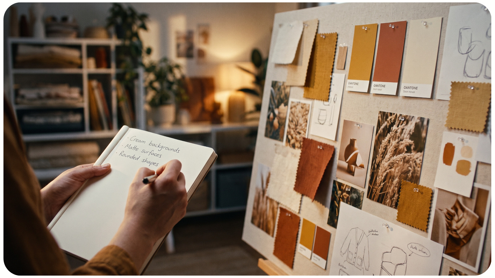
Write down three to five patterns you notice. Be concrete:
• Cream backgrounds with dark green linework;
• Small clusters rather than one large focal point;
• Matte, natural-looking surfaces;
• Deep red used only as an accent;
• Rounded, slightly imperfect shapes.
This short list is the bridge between inspiration and making. It turns a collection of references into a visual brief.
Your spring board does not have to be pastel, and your winter board does not need red and green. The goal is to discover your interpretation, not reproduce the most familiar seasonal decor.
Translate the Mood Into Materials
Now ask what each repeated quality would mean in a physical project. “Soft and faded” could become washed linen, chalky paint, muted embroidery floss, or torn handmade paper. “Crisp and graphic” might suggest high-contrast cross-stitch, cut-paper silhouettes, block printing, or a simple sewn checkerboard.
This is where you should consider what you already own. Spread out a few realistic materials beside the board: fabric scraps, thread cards, paper, paint chips, beads, ribbon, or yarn. Digital colors can make almost anything look harmonious. Real materials introduce limitations, which is helpful. The exact warm gray on your screen may not exist in your thread box, but a slightly browner shade might make the whole palette feel more grounded.
Build a small material palette instead of gathering every possible supply. For example:
• One ground material, such as ivory Aida cloth or natural linen;
• Three main colors;
• One accent color;
• One or two textures or decorative details.
You are testing whether the mood can survive contact with actual materials. If it cannot, adjust before investing hours in a project. If fabric is central to your plan, compare how color, count, and texture change the result before choosing your base; this guide to different types of cross-stitch fabric is a useful starting point.
Give the Board Three Possible Outcomes
Choosing one project immediately can create unnecessary pressure. Instead, give the mood board three possible expressions at different levels of effort.
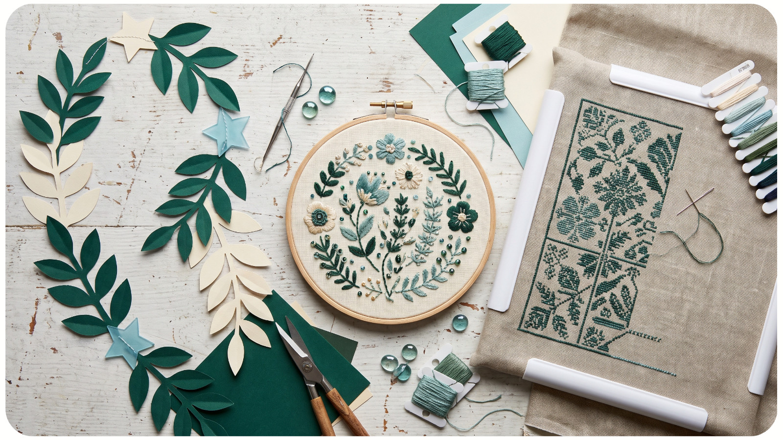
For a “quiet winter greenhouse” board, those options might be:
1. A one-evening paper garland using leaf and window shapes from the board;
2. A small embroidered linen ornament in the selected green-and-cream palette;
3. A detailed cross-stitch scene with glass panes, potted plants, and snow outside.
All three belong to the same visual idea, but they require different amounts of time and focus. This prevents every spark of inspiration from becoming a large undertaking.
Use the smallest option to test the idea. A postcard-sized collage, color study, stitched swatch, or single motif can reveal whether you enjoy the palette and materials. If the idea still holds your attention, expand it. If not, you have learned something without creating a major commitment.
Add Constraints That Match Your Real Life
A useful mood board needs a few practical notes. Otherwise, it will continue suggesting projects for a fictional version of you who has an empty weekend, a spotless worktable, and every supply within reach.
Choose limits before you choose the final project:
• Time: one evening, one weekend, or a month of short sessions;
• Space: lap-friendly, dining-table size, or dedicated studio space;
• Budget: use only existing supplies, buy one missing material, or plan a larger purchase;
• Energy: repetitive and restful, lightly challenging, or fully absorbing;
• Purpose: seasonal decor, a gift, a wearable piece, or simply a skill experiment.
Constraints give creativity a surface to push against. A two-hour limit might lead to painted gift tags instead of a wall hanging. A “use what I own” rule could turn leftover cranberry and gold floss into a tiny ornament. The mood stays intact; the project becomes possible.
Separate the Inspiration Board From the Project Board
Once you have selected a project, make a smaller second board for execution. The original board can remain atmospheric. The project board should be almost boring in its clarity.
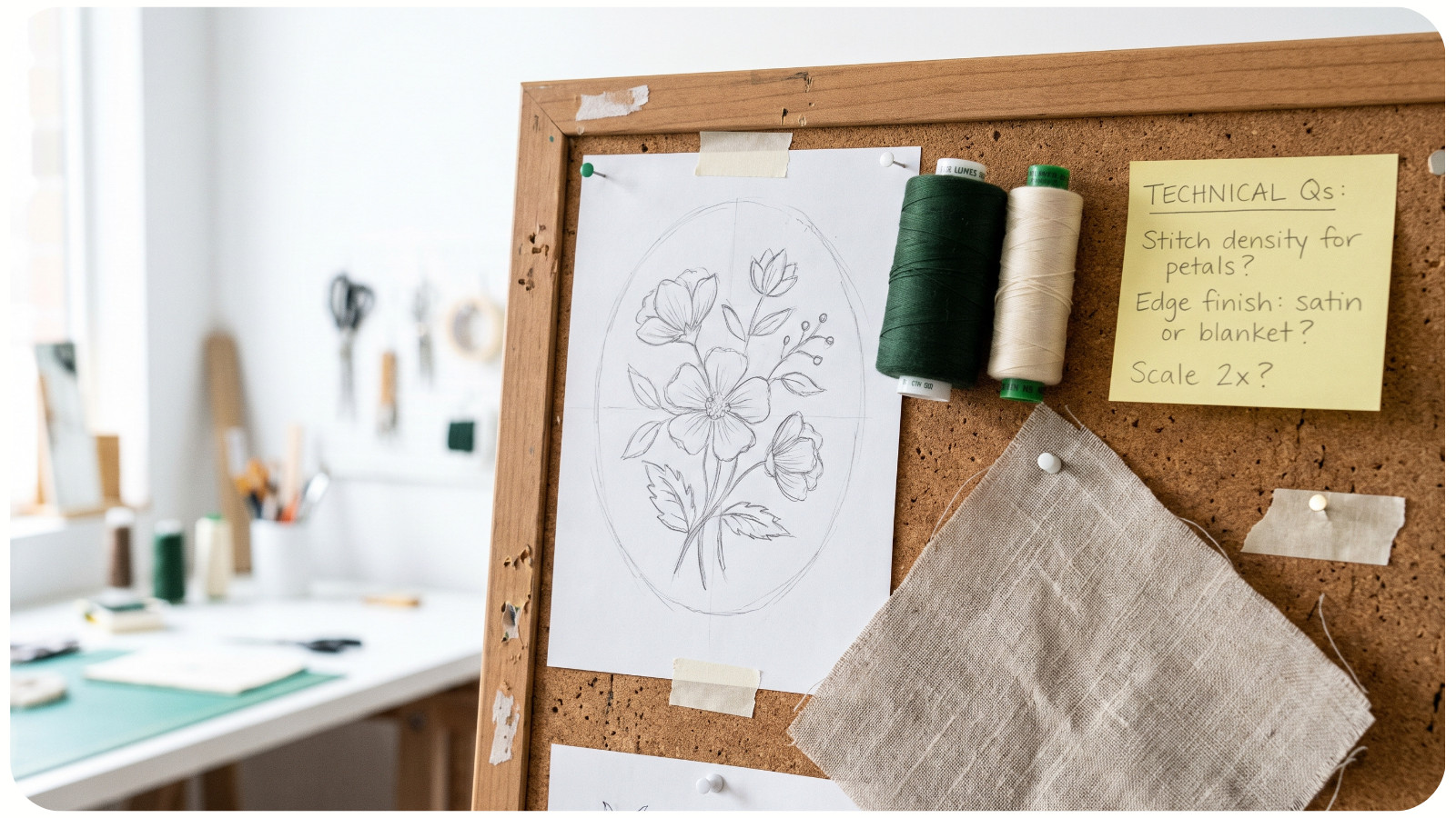
Include only what helps you make decisions: the final palette, two or three key reference images, approximate dimensions, materials, technique, and a rough sketch or pattern. If there are unresolved questions, write them directly on the board. “Border or no border?” is more actionable than saving ten additional images.
This separation also reduces accidental imitation. Your inspiration board may contain many artists, photographs, and objects. By the time you build the project board, you should be combining broad qualities rather than copying one source. Use references to understand color, rhythm, texture, and atmosphere, then create your own composition.
End Every Mood-Board Session With One Physical Action
The simplest way to keep a mood board from becoming a decorative archive is to end the session with a physical move.
Pull the fabric from your cabinet. Place the five thread colors in a small tray. Print the template. Cut one test shape. Put the sketchbook and pencil on the table where you will see them tomorrow.
The action should take less than ten minutes and make starting easier. “Begin the project” is too vague. “Cut a 10-inch square of linen” is clear. Creative momentum often depends less on motivation than on removing the first small obstacle.
A seasonal mood board has done its job when it changes what happens next. It may lead to a finished heirloom, a playful weekend experiment, or a tiny swatch that teaches you which colors belong together. The scale does not matter. What matters is that the season moves from something you admire into something you shape with your own hands.