



Choosing colors that “just work” together isn’t guesswork – it’s rooted in structured systems from color theory, perceptual psychology, and design practice. Whether you’re decorating a home, designing a DIY project, or styling seasonal decor, understanding how color relationships function will help you consistently create polished, visually balanced results.
This guide breaks down the technical foundations of color harmony and translates them into actionable steps you can apply immediately.
1. UNDERSTAND THE COLOR WHEEL STRUCTURE
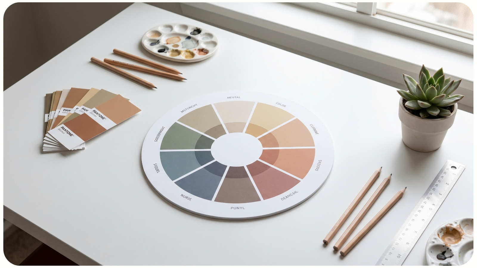
The foundation of all successful color combinations starts with the color wheel.
- Primary colors: Red, blue, yellow (cannot be created by mixing);
- Secondary colors: Green, orange, purple (made from primaries);
- Tertiary colors: Mix of primary + secondary (e.g., blue-green).
Why it matters: Colors positioned in relation to each other on the wheel determine harmony and contrast. This spatial relationship is the backbone of every palette system.
2. USE PROVEN COLOR HARMONY SCHEMES
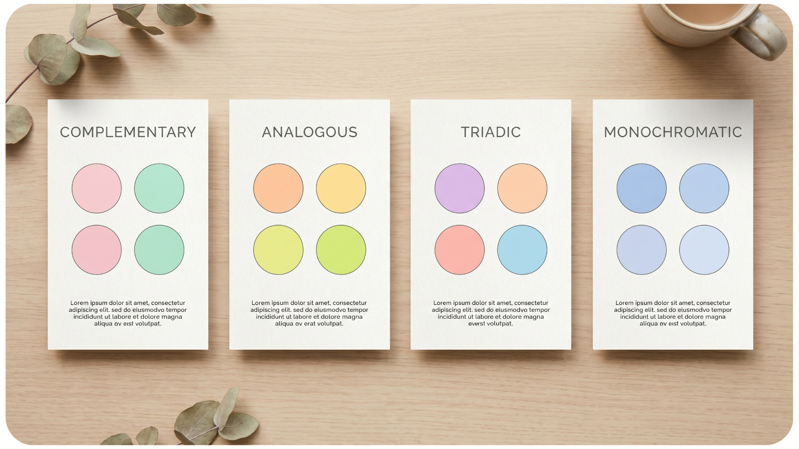
Designers rely on repeatable color schemes that consistently produce pleasing results.
A. Complementary (High Contrast)
- Opposite colors on the wheel (e.g., blue + orange);
- Creates bold, energetic visuals;
- Best used with one dominant color and one accent.
B. Analogous (Low Contrast)
- Colors next to each other (e.g., green, blue-green, blue);
- Naturally harmonious and calming;
- Ideal for interiors and lifestyle aesthetics.
C. Triadic (Balanced Contrast)
- Three evenly spaced colors;
- Offers vibrancy without chaos;
- Requires careful saturation control.
D. Monochromatic (Safe + Elegant)
- One color with variations in lightness and saturation;
- Extremely cohesive and beginner-friendly.
3. CONTROL SATURATION AND BRIGHTNESS (NOT JUST HUE)
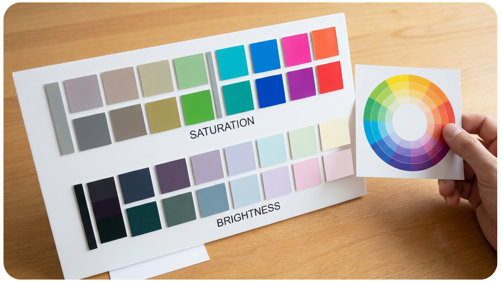
Most color mistakes come from ignoring intensity.
- Hue: The color itself (red, blue, green);
- Saturation: How vivid or muted the color is;
- Brightness (Value): How light or dark it appears.
Expert tip: Combine colors with similar saturation levels for cohesion. Mixing neon colors with muted tones often creates imbalance unless done intentionally.
4. APPLY THE 60-30-10 RULE
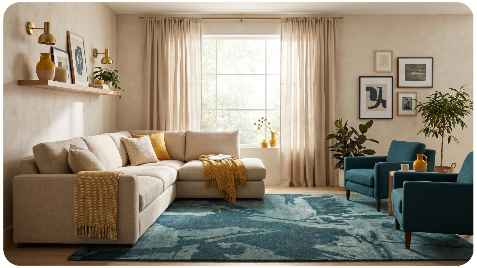
This is a professional composition guideline used in interior design and styling.
- 60%: Dominant color (walls, large surfaces);
- 30%: Secondary color (furniture, textiles);
- 10%: Accent color (decor, accessories).
Why it works: It creates visual hierarchy and prevents color competition.
5. USE NEUTRAL ANCHORS FOR STABILITY
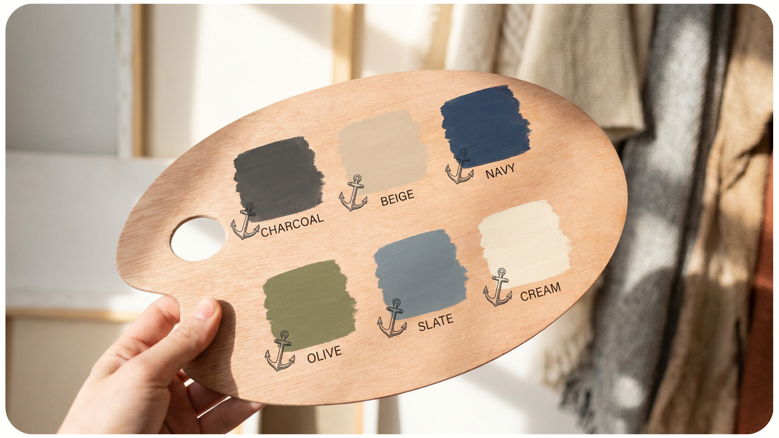
Neutrals aren’t just fillers – they stabilize palettes.
- Common neutrals: white, beige, gray, black, taupe;
- They reduce visual noise and allow accent colors to stand out.
Technical insight: Neutrals often have subtle undertones (warm or cool). Matching undertones is critical for cohesion.
6. MATCH UNDERTONES (THE HIDDEN RULE)
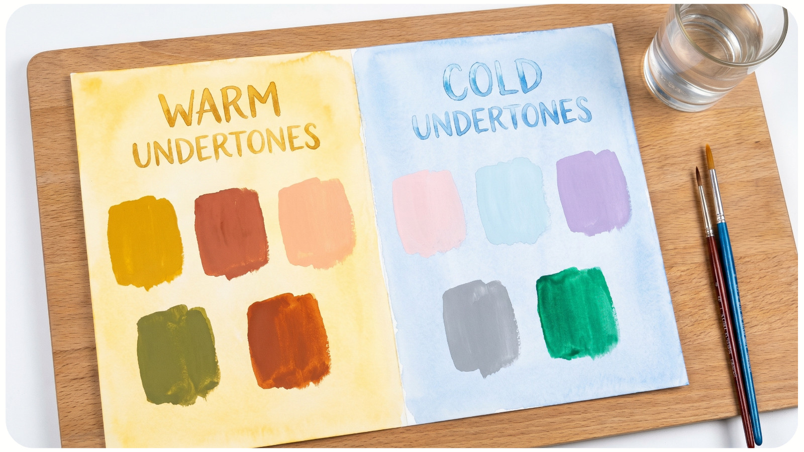
Every color leans either warm, cool, or neutral.
- Warm undertones: yellow, red, orange bases;
- Cool undertones: blue, green, violet bases.
Example:
- Warm beige + warm terracotta = harmonious;
- Cool gray + warm yellow = potential clash.
Pro tip: Always compare colors side-by-side in natural light before finalizing.
7. LIMIT YOUR PALETTE (3–5 COLORS MAX)
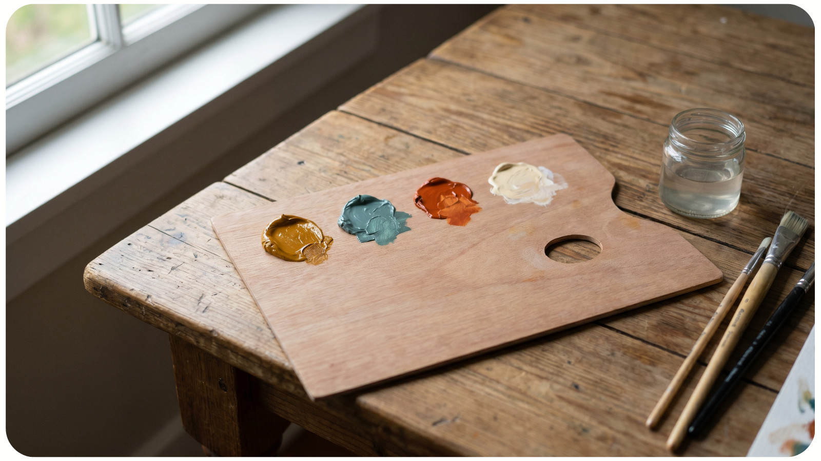
Too many colors reduce clarity and cohesion.
Ideal palette:
- 1 dominant color;
- 1-2 supporting colors;
- 1-2 accents.
Why it works: The human eye prefers structured simplicity over uncontrolled variety.
8. CONSIDER CONTEXT AND LIGHTING

Color perception changes based on environment.
- Natural light: reveals true color;
- Warm artificial light: enhances reds/yellows;
- Cool light: enhances blues/greens.
Advanced tip: Test swatches at different times of day – morning vs evening can drastically change appearance.
9. USE TEXTURE TO ENHANCE COLOR HARMONY

Color doesn’t exist in isolation – material affects perception.
- Matte finishes soften colors;
- Glossy finishes intensify them;
- Textures (wood, fabric, metal) add depth without adding new colors.
10. REFERENCE NATURE FOR FOOLPROOF COMBINATIONS
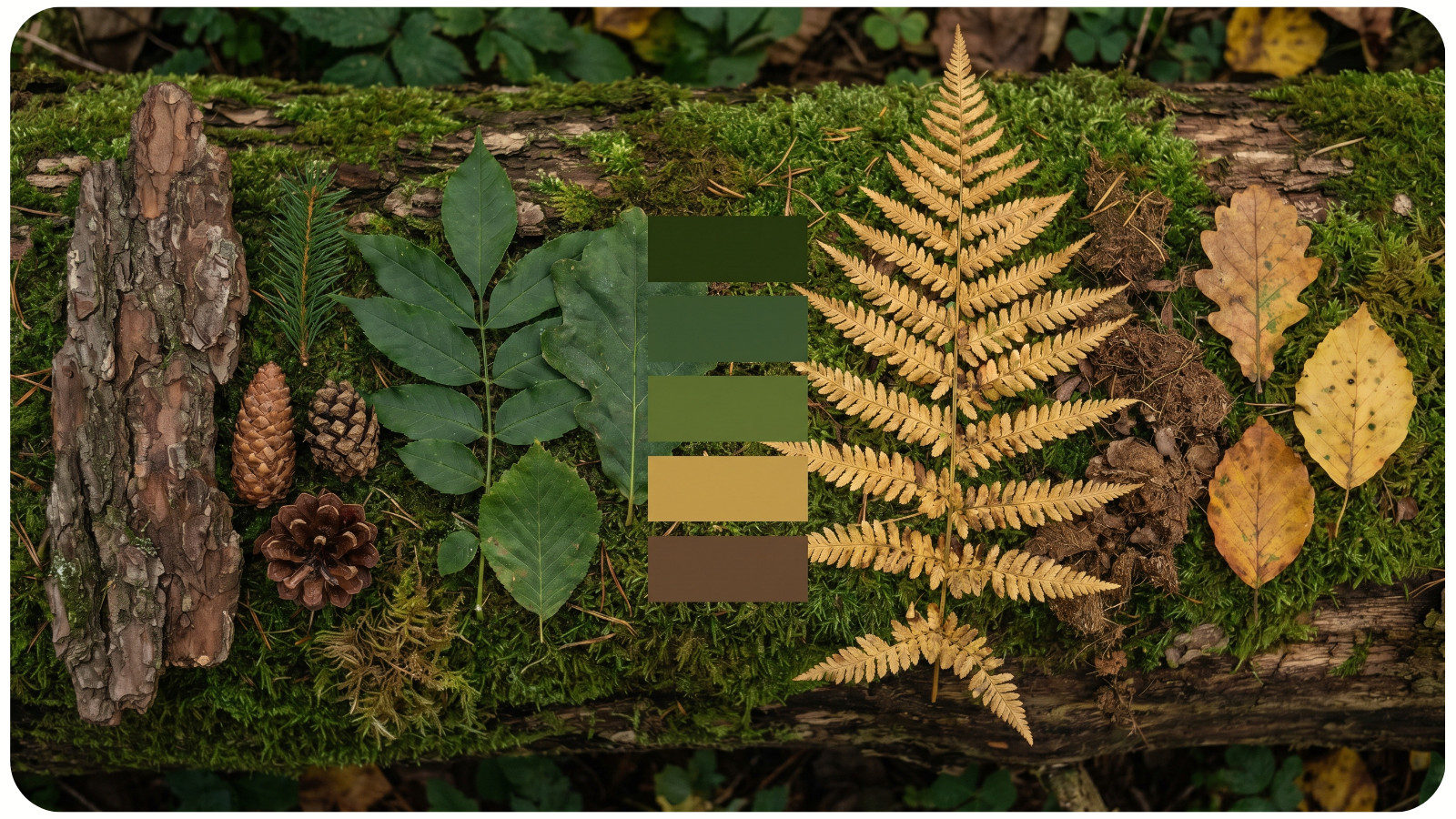
Nature is the ultimate color system.
- Forest palettes: greens, browns, muted yellows;
- Coastal palettes: blues, sandy neutrals, whites;
- Sunset palettes: oranges, pinks, purples.
Why it works: These combinations are already balanced through natural visual harmony.
CONCLUSION
Color combinations that “always work” aren’t accidental – they follow structured relationships rooted in the color wheel, controlled saturation, and balanced proportions.
By applying these technical principles – especially harmony schemes, undertone matching, and the 60-30-10 rule – you can confidently build palettes that look intentional, cohesive, and professionally designed.
If you’re unsure where to start, begin with a monochromatic or analogous palette and gradually experiment with contrast. Precision comes from practice – and a solid understanding of these core systems.