


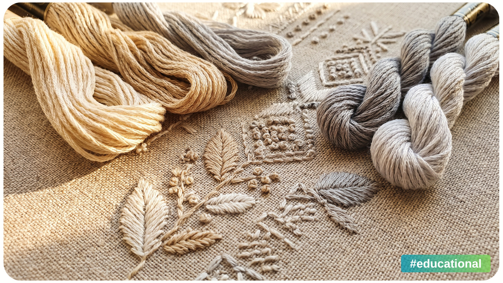
Two shades may both be called gray, yet one looks soft and beige beside the other. Two whites may seem identical until you put them together and notice that one leans creamy while the other leans blue. That subtle difference is color temperature. It can explain why a fabric, frame, thread, paint swatch, or background seems slightly out of place even when the color name sounds right.
The quick rule: compare neutrals of similar lightness side by side under the same light. A warm neutral tends to lean yellow, orange, or reddish brown. A cool neutral tends to lean blue or violet. If you cannot see a clear lean, it may be nearly neutral. Temperature is relative, so comparison tells you more than a label such as “white,” “gray,” or “beige.”
What Are Warm and Cool Neutrals?
Neutral colors include white, gray, beige, taupe, brown, and black. Many have a faint color cast, often called an undertone. Cream usually has a yellowish lean. A blue-gray has a cool lean. A tan with a touch of orange reads warmer than a tan that leans pink-violet.
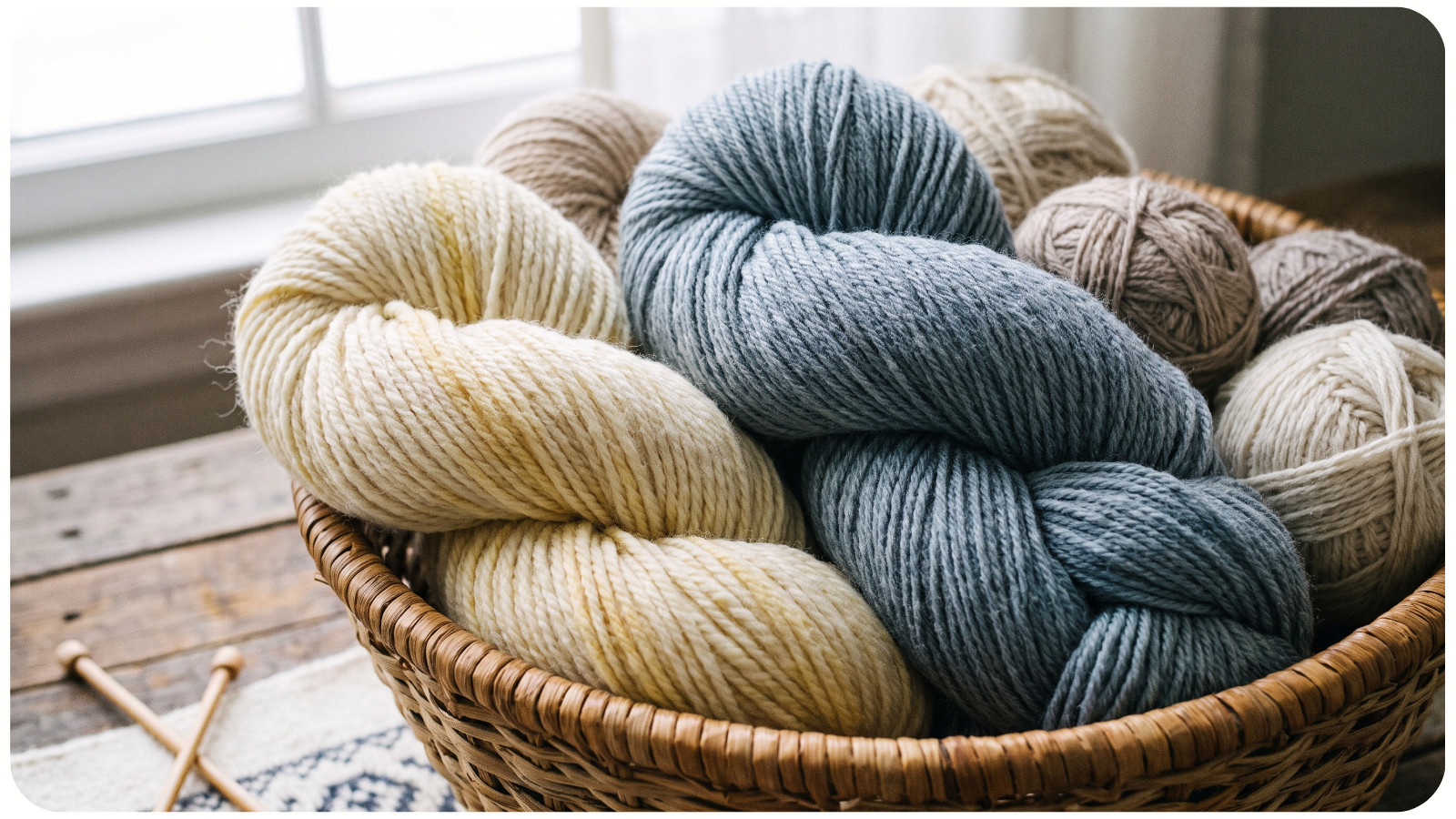
A color's temperature is separate from its lightness, or how light or dark it appears. A pale warm ivory and a pale cool gray may be equally light. A dark espresso brown can still be warm, while a dark charcoal can be cool. Temperature alone also does not tell you whether two colors have enough light-dark contrast for text or fine details.
Think of warm and cool as positions on a scale, not two rigid boxes. A gray that looks cool next to cream may look warm next to a bluer gray. Taupe is especially hard to name because different versions can lean brown, pink, violet, or green. You do not have to classify every subtle shade with certainty.
Neutral | Warm-leaning example | Cool-leaning example |
|---|---|---|
White | Cream or ivory with a yellow cast | Off-white with a faint blue or violet cast |
Gray | Gray with a beige or brown cast | Gray with a blue or violet cast |
Beige or taupe | Tan with a yellow or orange cast | Taupe with a muted violet cast |
Dark neutral | Brown-black with a reddish cast | Charcoal with a blue cast |
These examples describe common appearances, not fixed meanings for every product sold under those names. Look at the actual sample rather than relying on a color name or a screen preview.
How to Tell If a Neutral Is Warm or Cool
You need two real samples and a steady light source. Use this test for paper, fabric, thread, paint chips, packaging, or decor:
1. Choose samples that are about equally light. A very dark gray next to a pale beige makes lightness the most obvious difference and can hide the undertone you are trying to see.
2. Place them next to each other on a plain surface. A matte white or light gray card works well. Move bright colored objects out of the immediate background so they do not distract you.
3. Use the same light for both. Bright, indirect daylight is a useful starting point. Do not put one sample in sun and the other in shadow.
4. Ask which direction each color leans. Does the white look buttery or slightly blue? Does the gray look beige, violet, or blue-gray? Compare a third sample if the difference is still hard to see.
5. Check the samples in their real setting. Hold a thread beside the fabric, a frame beside the print, or a paint chip against the wall. Then step back and judge the whole arrangement.
If you only have a screen image, treat the result as a first impression. Displays and photos may show a shade differently from the physical material. For a close match, order or gather actual samples when possible.
Why Does a Neutral Change Under Different Light?
A warm-toned lamp can make a cool white seem less blue. In another room, the difference between two grays may become more visible. Some materials that appear to match under one light can separate under another. When a choice matters, compare samples in daylight and under the light where the finished work will usually be seen.
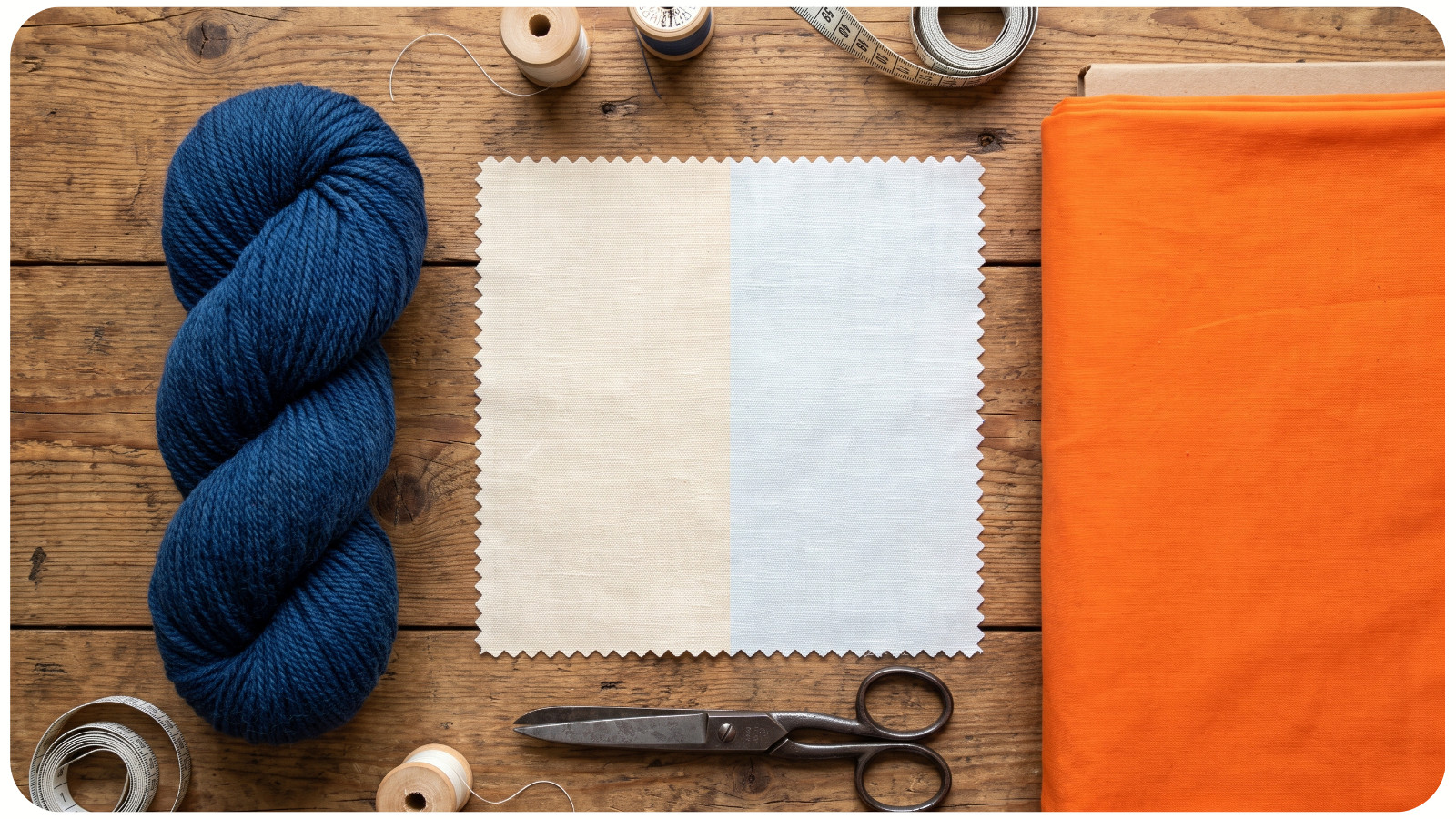
Surrounding colors also change what you notice. Put ivory beside a deep blue and its warmth may be obvious. Put the same ivory beside orange and it can seem almost cool by comparison. The ivory has not changed; its neighbor has. This is why a neutral that looked right alone may feel wrong once the rest of a palette is in place.
Material changes the result too. Matte paper, shiny thread, textured linen, glossy paint, and faceted craft drills reflect light in different ways. Compare the real surfaces, not just two printed color chips, before making a close match across materials.
When Should You Match Temperatures, and When Can You Mix Them?
Matching undertones can make nearby neutrals feel more closely related. For example, warm ivory fabric beside warm beige thread may form a quiet background for a stitched motif. A cool gray mat and a cool off-white print border can create a similarly close relationship. If your palette has several shades, choosing colors that work together can help you think beyond one pair.
You can also mix temperatures on purpose. A warm cream against a cool slate gray can make each look more distinct. In an illustration of a winter house, warm window light and cool snow shadows may help describe the scene. There is no rule that every neutral in a project must share the same undertone.
Look at the job each shade needs to do. Are you trying to make a background blend gently, separate two shapes, or show a change in light? Then check lightness as well as temperature. Two different undertones that are equally light may still merge at a distance. Two well-matched warm shades can still have strong contrast if one is much darker.
Common Mistakes When Choosing Neutral Colors
Judging by the name alone. “Ivory,” “stone,” and “greige” cover a range of shades. Compare the actual material before buying a large amount or replacing a color in a project.
Comparing samples under different lights. Even a simple side-by-side test loses value if one sample is near a window and the other sits under a yellow lamp. Bring them together first.
Confusing warmth with lightness. A cream may stand out against a gray because it is lighter, warmer, or both. To find the cause, compare samples of similar lightness and then check the full arrangement.
Forgetting the final surface. A shiny finish can catch bright reflections that hide a faint undertone. Tilt the sample or look from another angle. A screen preview is helpful for planning, but physical materials deserve a final check.
Trying to make every neutral match. A contrast between warm and cool can be useful. Decide whether the difference supports the image or object before calling it a mistake.
A Two-Minute Neutral Color Test
Gather a cream, a gray, and a beige sample from materials you already own. Put them on one matte card under the same light. Compare pairs of similar lightness and name the faint color you see: yellow, brown, blue, or violet. Next, move the samples beside the fabric, picture, wall, or artwork where you plan to use them. Notice whether the undertone becomes clearer or seems to change. Choose the neutral that helps the whole piece read the way you intend, rather than the one with the most appealing name.