



There is a certain hour in autumn when an ordinary room seems to become a painting.
The sun sits lower, the shadows stretch farther, and a warm stripe of light moves across the table. A white mug turns cream. A gray wall picks up lavender. Even loose threads beside a half-finished project seem richer than they did at noon.
The objects haven’t changed. The light is simply showing us that color is never as fixed as the label on a paint tube or the number on a skein of floss.
Autumn makes this especially visible. Its light is slanted, selective, and brief. It warms one surface, cools another, and lets some colors glow while others become quiet. If you enjoy painting, stitching, sewing, or simply noticing beautiful things, autumn light can teach you how color really works.
Color Is a Relationship, Not a Solo Performance
We often talk about colors as if they have permanent personalities. But place a mustard-yellow leaf on a pale wooden table and it may look soft and mellow. Move it onto deep navy fabric and suddenly it appears almost electric.
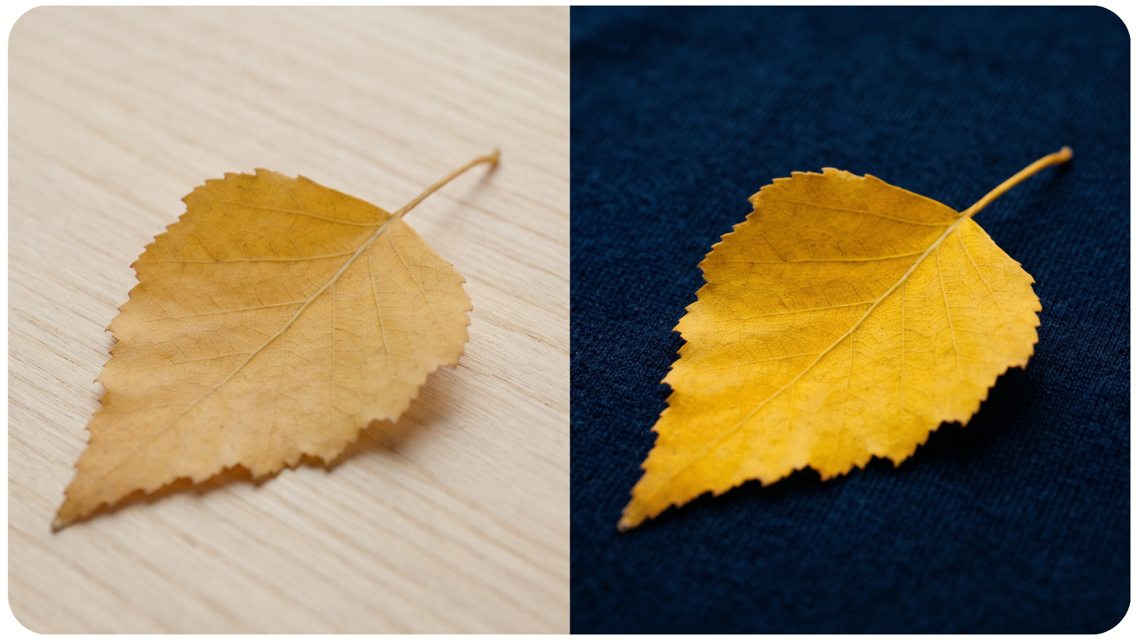
Autumn landscapes make these relationships easy to see. Orange leaves look warmer beside a blue-gray sky. Burgundy seems deeper near faded grass. A dark green pine becomes more vivid when surrounded by copper and gold. These are the same principles explored in cross-stitch color theory and combinations, just playing out on a much larger canvas.
When choosing colors, don’t judge each one alone. Arrange them side by side in roughly the proportions you plan to use. A tiny accent of rust may enliven a large area of sage. Across half the design, it might dominate.
This applies far beyond paint. Lay embroidery threads on the actual fabric instead of evaluating them in your hand. Place paper scraps together before cutting a collage. Color begins to make sense when it has company. If floss is your medium, this guide to choosing cross-stitch threads and color combinations offers a practical next step.
Warm Light Can Make Familiar Colors Feel New
Low autumn sunlight can act like a temporary warm glaze over the world. Pale stone looks honey-colored, green leaves shift toward olive, pink becomes peach, and white turns golden along its brightest edge.
This is a useful reminder that you don’t always need a radically different palette to create a different mood. Sometimes a small shift in temperature is enough.
Imagine floral embroidery in fresh green, petal pink, bright yellow, and crisp white. An autumn version doesn’t require changing the subject. Choose moss, dusty rose, ochre, and warm ivory instead. The relationships remain recognizable, but the emotional temperature changes.
Try giving one of your favorite palettes a “late-afternoon” makeover. Warm the neutrals. Soften the brightest color. Add one deep, cool note for contrast. You may end up with something seasonal without relying on the expected lineup of pumpkin orange, leaf red, and chocolate brown. For more combinations to test, explore these cross-stitch color palette ideas.
The Most Beautiful Autumn Colors Are Often Muted
The spectacular red maple gets most of the attention, but autumn’s quieter colors often do the heavy lifting: weathered bark, dry seed heads, fog, old brick, damp soil, and the silvery underside of a leaf.
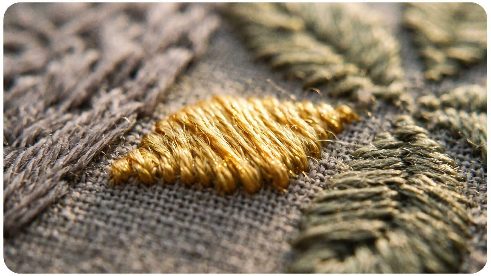
These colors are difficult to name, which is part of their charm: brown with violet in it, green softened by gray, pink leaning toward clay. In a craft store, they may not stand out. In a finished piece, they can hold everything together.
Muted colors give the eye somewhere to rest. A small patch of golden yellow feels luminous when surrounded by taupe, smoky blue, and dull olive. Among five other intense colors, it has to compete.
If a project feels loud or disconnected, the answer may not be removing the colors you love. Try introducing a quieter bridge color between them. A dusty plum can connect red and blue. Tan can soften the jump between cream and dark brown. Gray-green can settle a palette filled with warm florals.
Autumn teaches that subdued does not mean lifeless. A color can whisper and still be essential.
Shadows Have Color Too
One of the loveliest things about autumn light is the length of its shadows. They slide across sidewalks, curtains, table linens, and fields, turning familiar shapes into simple compositions.
It’s tempting to reach automatically for black when representing shadow. Look closely, though, and shadows are rarely just black or gray. On a golden wall, one may appear blue-violet; across red leaves, it might look like deep wine.
You can bring this observation into almost any medium. In painting, test a dark version of the surrounding color before adding black. In cross-stitch or embroidery, build depth with two neighboring shades rather than outlining every form in the darkest thread available. In quilting, consider whether a deep plum or forest green would create a richer “dark” than plain black.
Colored shadows can make an image feel more alive because they remain connected to the rest of the palette. They suggest atmosphere rather than simply marking where the light stops.
Contrast Creates the Glow
Autumn light feels golden partly because it is seen beside coolness and darkness. A lit window looks brightest against an evening sky. A yellow tree glows when its trunk and surrounding branches are nearly charcoal. Light becomes visible where one value or temperature meets another.
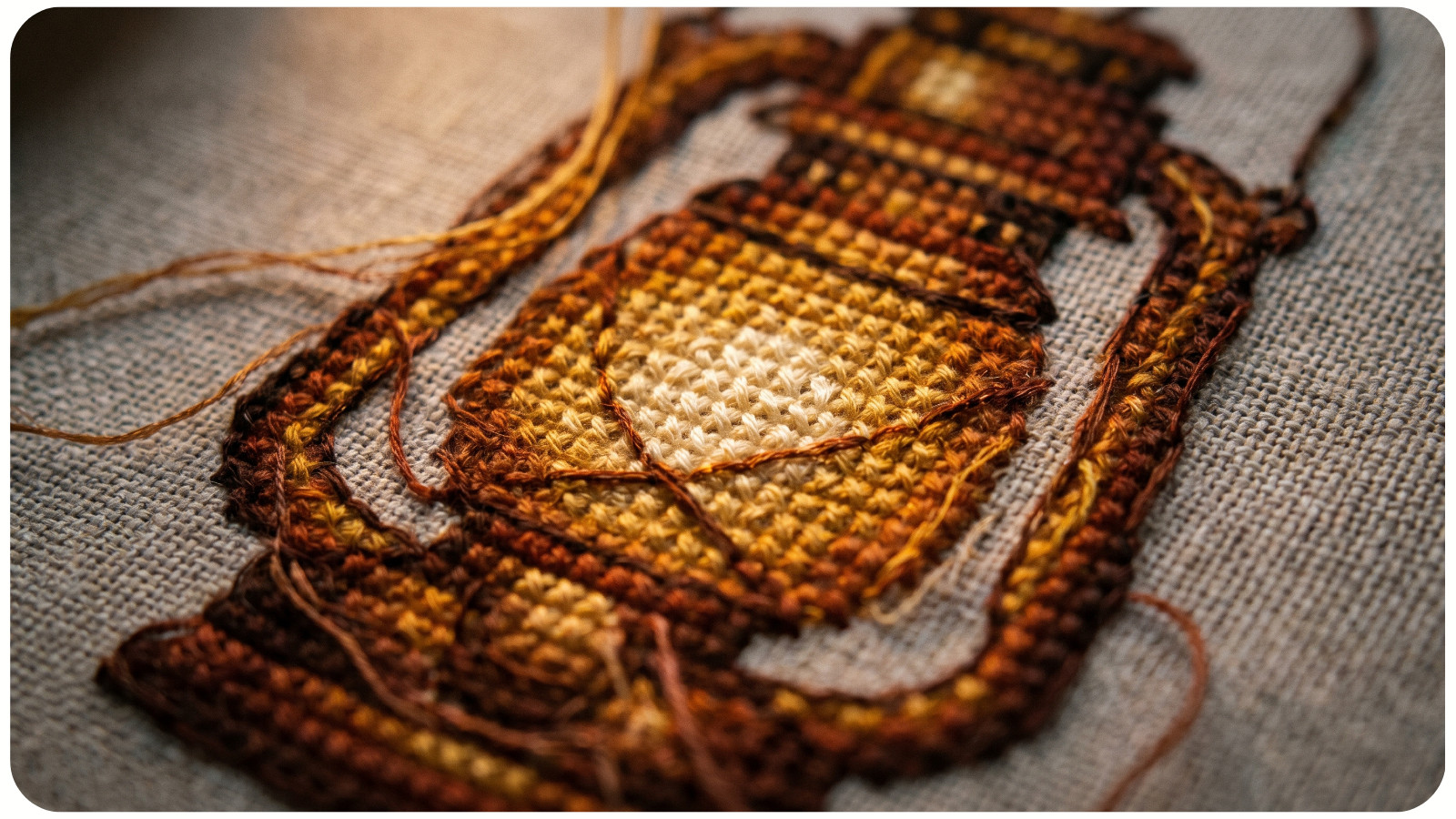
This is a helpful lesson for anyone who has ever tried to make a handmade piece look luminous. Adding more yellow is not always the solution. Sometimes the light area simply needs a darker neighbor. In other words, a little contrast goes a long way.
If you are stitching a lantern, candle, sunset, or cozy window, save your lightest cream for a very small area. Surround it with gold, amber, rust, or deep brown. If you’re painting, compare the bright shape with the value directly beside it before making the highlight lighter. In paper crafts, a warm metallic detail may have more impact on matte navy than on another pale surface.
Glow is not contained in one color. It happens through contrast.
A Limited Palette Can Hold a Whole Season
An autumn walk may seem full of countless colors, yet one small corner of it can offer a complete palette. A single fallen branch might contain pale lichen, gray bark, rust-colored leaves, and one dark brown stem. That is enough for a beautifully balanced project.
Working with a limited palette can be freeing when shelves, screens, and supply boxes offer too many choices. Begin with a small scene you love. Choose four or five colors from it, adding lighter and darker versions only when necessary.
You might build a woven wall hanging from wheat, clay, charcoal, and cream, or stitch a botanical motif in olive, ochre, brown, and soft blue. Limitation encourages you to notice proportion and texture. The same ochre thread feels different in scattered cross-stitches, a smooth satin-stitched shape, or a loose tassel. You can also browse cross-stitch patterns to see how different designs balance color across an entire composition.
Notice How Quickly the Scene Changes
Autumn light rarely waits for us. A glowing patch on the floor disappears. Clouds move in. The sky cools before the eye has finished studying it.
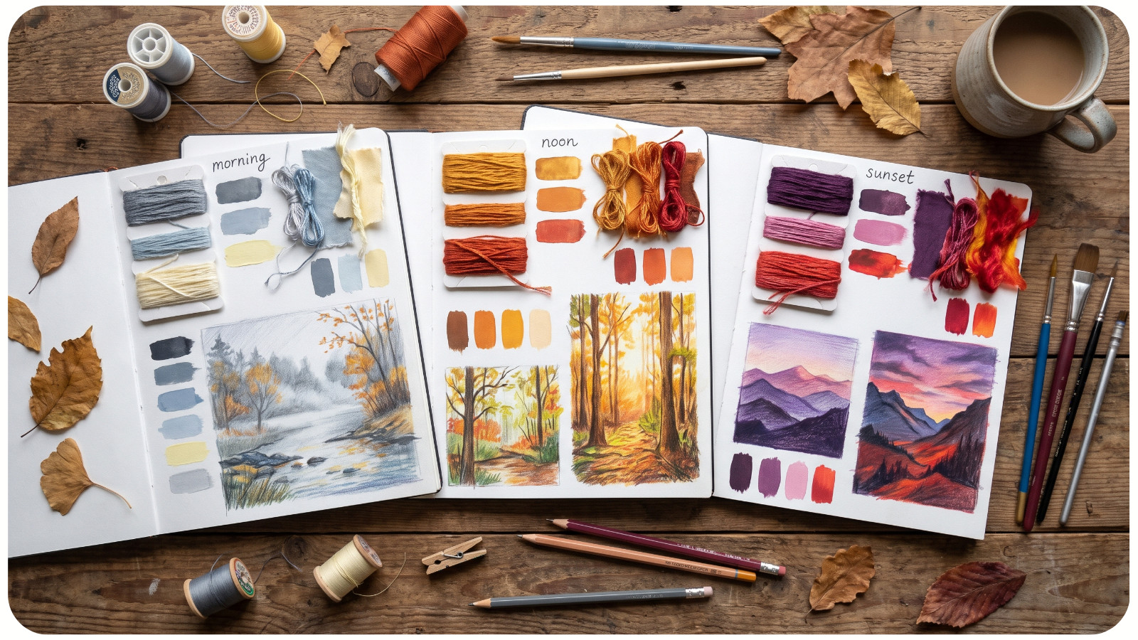
That change can loosen your grip on perfection. There may be no single “correct” color for a leaf, a wall, or a distant hill, only the color you saw in that moment, under that light, from where you stood.
For a simple exercise, choose one window view and record it at three different times. Use colored pencils, thread scraps, paint swatches, fabric, or written color notes. Which colors became warmer? Which details disappeared? Did the shadows turn blue, purple, or green?
The purpose isn’t to match nature perfectly. It is to train yourself to notice shifts you might otherwise overlook.
Borrow the Light, Not Just the Leaves
Autumn projects often begin with pumpkins, acorns, mushrooms, and red-orange foliage. They return each year because they are beautiful. But the season offers a richer source of inspiration than a collection of objects.
You can borrow the way autumn light warms an ordinary interior. You can borrow its long violet shadows, softened greens, glowing edges, and misty distances. You can create an autumn feeling with a portrait, an abstract quilt, a geometric pattern, or a still life that contains no leaf at all.
The next time late sunlight enters your room, pause before reaching for the camera. Look at an overlooked object: a spool of thread, a cardboard box, a shirt sleeve. Notice what the light has done to its color and what nearby color makes it beautiful.
Then carry that small discovery into something you make. Not as a rule, and not as a palette you must copy exactly, but as evidence that color is alive. It changes with its surroundings, with the hour, and with the attention we give it. Autumn simply makes the lesson harder to miss.