


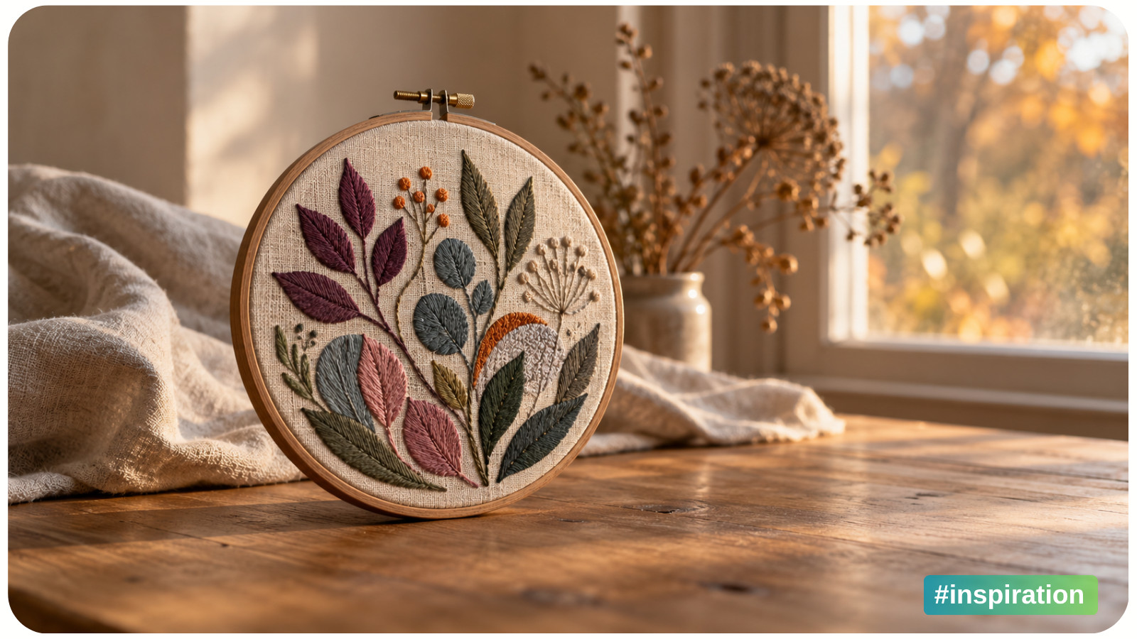
For a long time, fall color came with a dependable little uniform: pumpkin orange, maple-leaf red, mustard yellow, and a generous amount of brown. It worked beautifully. Those colors were instantly recognizable, easy to find in nature, and perfectly at home on everything from quilted table runners to hand-painted porch signs.
But the season has more colors than the classic fall aisle ever gave it credit for.
Look closely at an October morning and you may find misty blue, mushroom gray, faded lavender, dark evergreen, dusty rose, and the soft cream of dried grasses. A late-season garden adds plum, burgundy, and nearly black seed heads. Even the pantry contributes oat, sage, fig, and the warm beige of a well-used linen towel.
That broader view of the season has gradually changed the way makers, decorators, and designers build fall palettes. Orange and red haven’t disappeared. They simply have more interesting company now.
Why Orange and Red Became the Fall Shortcut
Traditional fall palettes make perfect visual sense. Deciduous leaves turn yellow, orange, and red. Pumpkins arrive at farm stands. Apples, cranberries, corn, and wheat connect the season with harvest and abundance. These colors also translate easily into festive decor because they are warm, saturated, and readable from across a room.
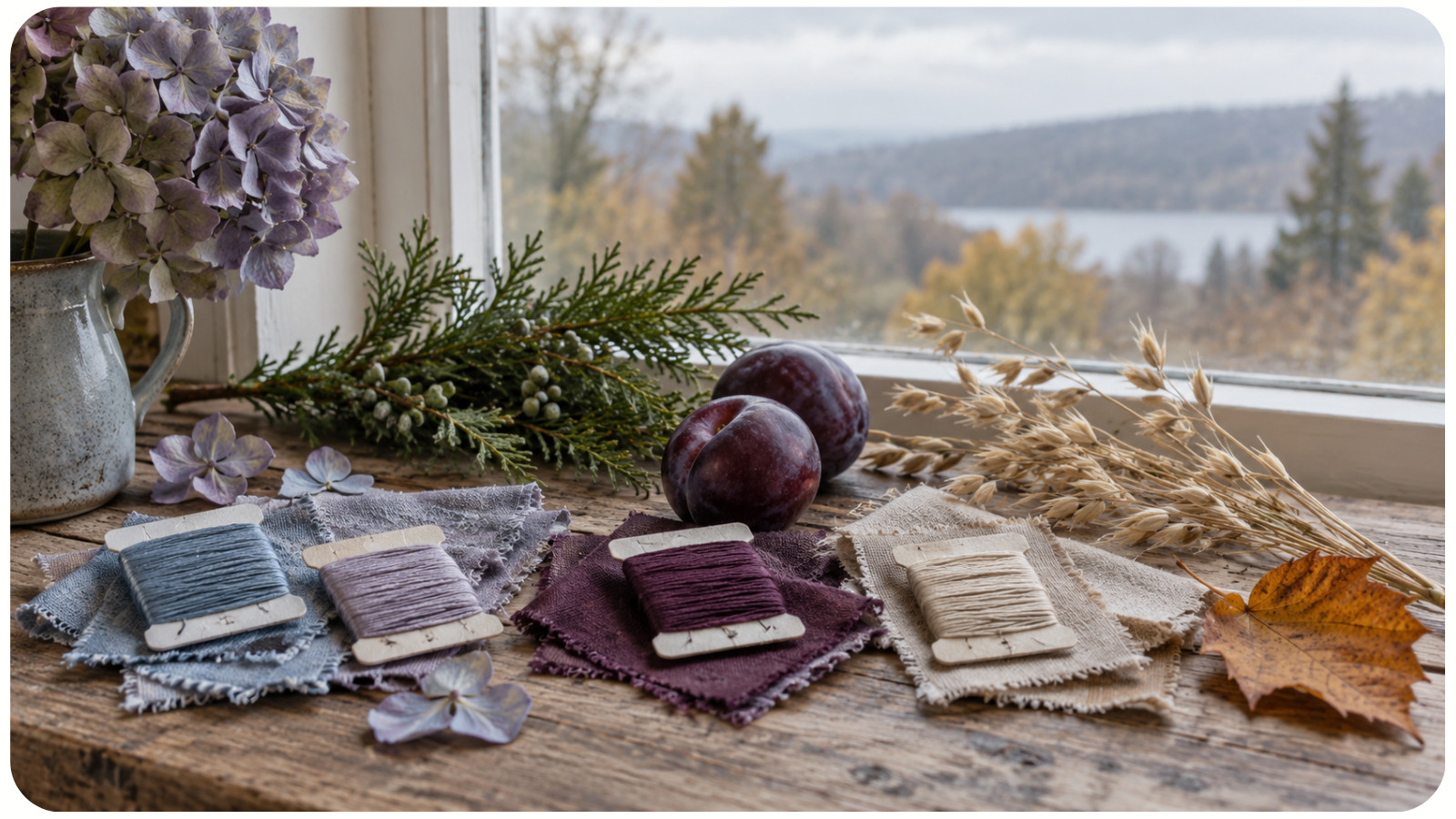
Over time, that familiar group became a kind of seasonal shorthand. Add a burnt-orange ribbon to a wreath and it immediately says “fall.” Stitch a red maple leaf beside a small pumpkin and no one wonders which month you had in mind.
The trouble with shorthand is not that it is wrong. It is that it leaves out detail. A season can feel cheerful, quiet, moody, earthy, crisp, nostalgic, or even a little mysterious. One standard palette cannot express all of those moods equally well.
The Palette Expanded When We Looked at the Whole Season
Modern seasonal color stories borrow from more than peak foliage. They take in the sky, weather, architecture, clothing, food, and the changing quality of light. This wider lens makes room for colors that once seemed “unseasonal” - and it gives makers far more ways to create a distinct mood.
Blue is a good example. A clear fall sky can make gold leaves look brighter, while a stormy blue-gray gives a project the hushed feeling of a rainy afternoon. Pink may come from fading hydrangeas, late roses, apples, or the mauve cast of leaves just before they brown. Green remains present in pine branches, moss, herbs, gourds, and leaves that have not yet turned.
Recent color forecasting reflects this mix-and-match approach. The Pinterest Palette for 2025 paired Cherry Red with Butter Yellow, Aura Indigo, Dill Green, and the creamy neutral Alpine Oat. Pantone’s Autumn/Winter 2026–2027 color direction likewise combined grounded, familiar shades with more expressive color. These reports describe trends, not rules, but they show how comfortable people have become with seasonal palettes that cross old boundaries.
The same shift is easy to spot in handmade work. A fall quilt no longer needs to resemble a pile of maple leaves. It might use fog blue, olive, and flax to suggest a quiet cabin weekend. An embroidered mushroom can sit among lavender-gray grasses instead of bright orange foliage. A paper garland can pair burgundy with blush and cream for a softer harvest-table mood.
New Fall Palettes Borrow From Place, Not Just Tradition
Fall does not look the same everywhere. New England foliage may deliver the classic scarlet-and-gold spectacle, but a Pacific Northwest fall can be fern green, cedar brown, mist gray, and deep lake blue. In the Southwest, clay, sand, faded coral, juniper, and an enormous blue sky create a completely different seasonal story. Coastal fall may be built from weathered wood, sea glass, navy, and dune grass.
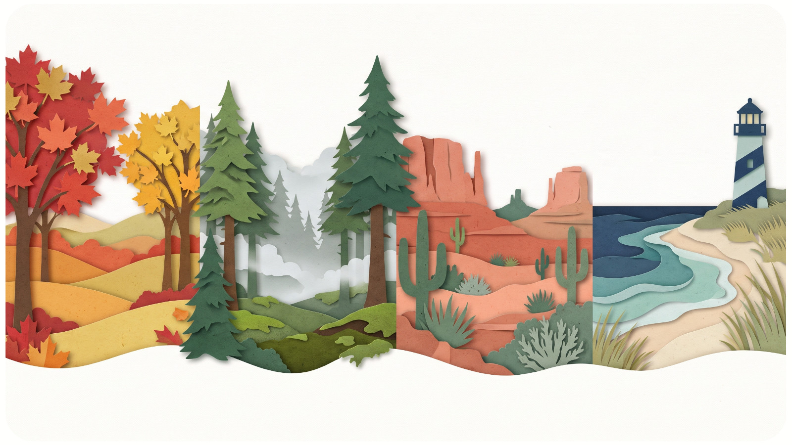
This is useful for makers because a palette rooted in a real place tends to feel more specific. Instead of asking, “Which colors are considered fall colors?” begin with, “What does fall look like where this project belongs?”
For a stitched landscape, that might mean choosing thread colors from a favorite national park photograph, then browsing nature-inspired cross-stitch designs to see how different subjects balance color and detail. For a wreath, it could mean matching the seed pods and evergreens found on a local walk. For a set of napkins, it may be the colors of the farmers market: eggplant, kale, pear, and pale squash.
Specific inspiration produces a palette with a point of view. It also makes the finished project feel personal rather than generically seasonal.
Five Modern Color Directions That Still Feel Like Fall
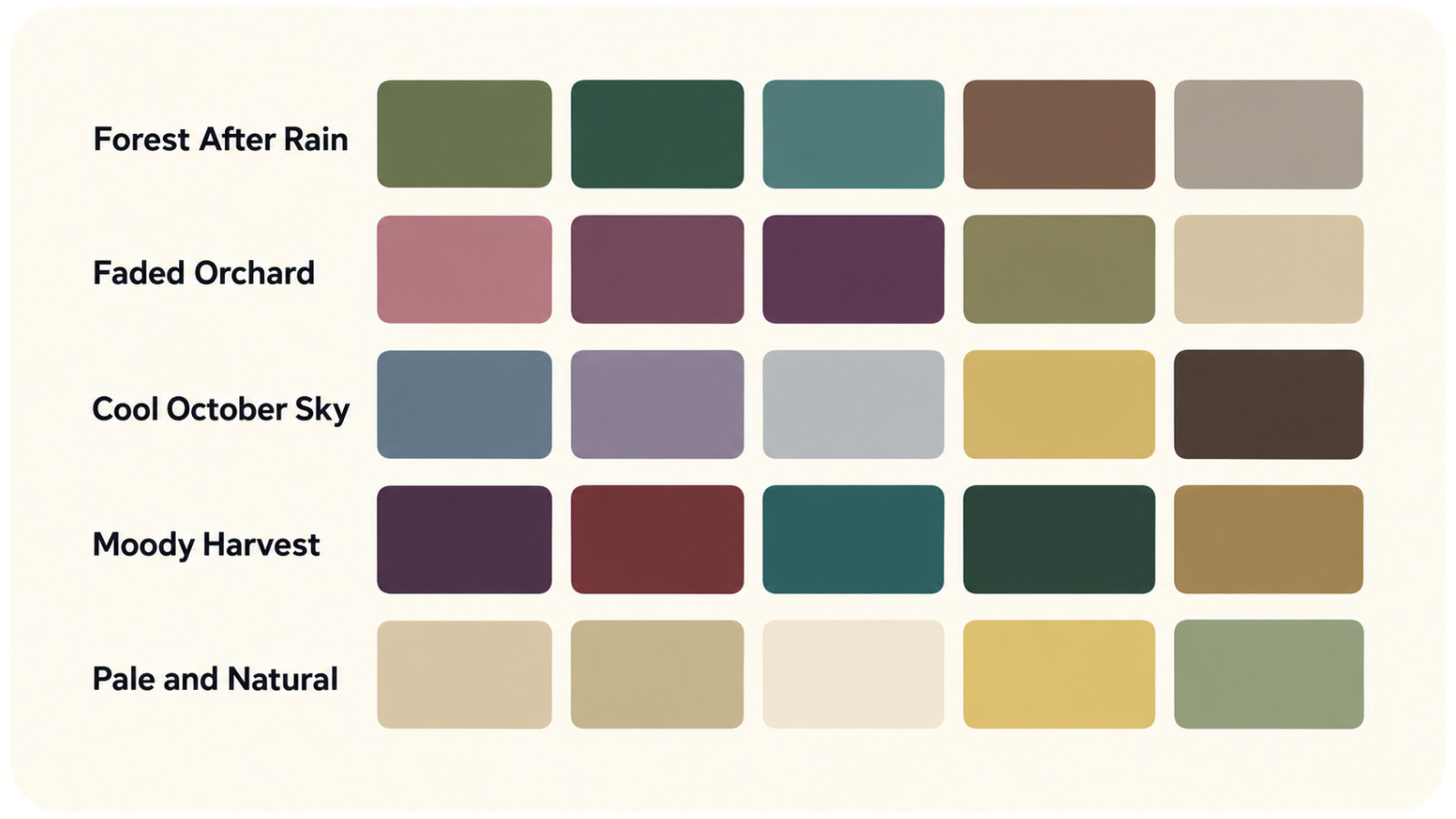
There is no single “new fall palette.” The more interesting change is that makers now have several directions to choose from. These five combinations can guide anything from a stitched design to table linens, paper crafts, or handmade decor. You can also browse seasonal embroidery designs for more ways color can signal a season without relying on one formula.
Forest After Rain
Combine moss, pine, muted teal, bark brown, and mushroom gray. Add a small touch of copper or amber if the palette needs warmth.
This group feels natural and grounded without depending on orange. It works especially well for woodland embroidery, botanical prints, felt ornaments, patchwork, and nature-inspired cross-stitch. Texture matters here: wool felt, linen, matte paper, and subtly variegated thread help the colors feel rich rather than gloomy.
Faded Orchard
Try dusty rose, fig, plum, soft olive, and warm oat. The result is gentle and nostalgic, like fruit trees and flowers at the end of their season.
This palette suits floral needlework, fabric pumpkins, handmade cards, table linens, and small gifts. It also plays nicely with vintage-inspired motifs. If the colors begin to look too springlike, deepen one shade to burgundy or chocolate and use cream instead of bright white.
Cool October Sky
Build the palette from slate blue, smoky lavender, cloud gray, pale gold, and dark brown. It captures crisp air and long shadows rather than the leaves themselves.
Use it for minimalist wall art, geometric quilts, landscape stitching, woven pieces, or painted ceramics. Pale gold is the quiet bridge that keeps the blues and grays connected to fall. A little goes a long way.
Moody Harvest
Pair aubergine, oxblood, deep teal, blackened green, and antique brass. These are still harvest colors, simply viewed after sunset.
The combination feels dramatic without requiring Halloween imagery. It is lovely for celestial motifs, dark florals, decorative insects, ornate samplers, candle labels, or dinner-party details. Choose one deep color as the largest area and let the others act as accents; using all of them equally can make a small project feel crowded.
Pale and Natural
Use oat, flax, warm cream, butter yellow, light clay, and a restrained touch of sage. This palette takes its cues from dried grasses, grain, natural fabric, and soft afternoon light.
It is a good choice when the project needs to live in a neutral home or when you want seasonal decor that can remain out through early winter. Contrast is the main challenge. On cream fabric or paper, include at least one medium-value color - perhaps caramel, olive, or warm gray - so the design does not fade into the background.
How to Build a Seasonal Palette Without Losing the Fall Feeling
When you move beyond obvious fall colors, structure becomes more important. A simple four-part formula keeps the palette coherent. For a deeper look at hue relationships and harmony, start with this guide to understanding color schemes.
1. Choose one anchor color. This is the shade that carries most of the mood: deep green, dusty plum, slate blue, or warm cream.
2. Add two supporting colors. Look for shades that could plausibly appear in the same landscape, room, or still life.
3. Include a bridge neutral. Oat, mushroom, charcoal, flax, or soft ivory gives the stronger colors space to breathe.
4. Finish with one small seasonal spark. Copper, cranberry, amber, or golden yellow can provide an unmistakable hint of fall without taking over.
Before committing to materials, arrange the colors in roughly the proportions you plan to use. Five skeins laid in a neat row may look perfect even when the design will use far too much of the darkest one. Make a tiny paper collage, wrap thread around a card, or create a quick swatch with fabric scraps. Proportion often matters as much as the color choices themselves.
Check the palette in the light where the finished piece will live. Warm lamps can turn lavender gray muddy, while strong daylight may make subtle beige shades look nearly identical. This is especially important in cross-stitch and embroidery, where neighboring colors must remain distinct in very small areas. If you want to create the background color yourself, review the basics of dyeing cross-stitch fabric before testing a swatch.
You Do Not Have to Break Up With Pumpkin Orange
Expanding a seasonal palette is not the same as rejecting tradition. Orange and red still bring warmth, energy, and instant recognition. The difference is that they no longer have to do all the work.
A single persimmon accent can glow against deep teal. Rust looks sophisticated beside dusty pink. Cranberry feels fresh with pale blue and oat. Even the most familiar pumpkin orange can change character when paired with plum instead of brown or with sage instead of mustard.
The best modern fall color palettes feel less like a rulebook and more like paying attention. Notice the blue between the branches, the green that stays after the first cold night, the pink edge of a pear, or the gray of rain on stone. The season was never limited to orange and red. We have simply become better at seeing the rest of it.